Employee merch for Pride Festival
At OrderlyMeds, I made it possible to look cool while repping the company at Atlanta Pride. Approaching this project, I knew I wanted more than just “logo, but rainbow” (that’s so 2015.) I created a collection that represents taking pride in our diversity, our city and our wellness. I received the best feedback one can get in these situations: “omg, good swag exists?! I actually want to wear this, love it.”
art direction, design / created at OrderlyMeds
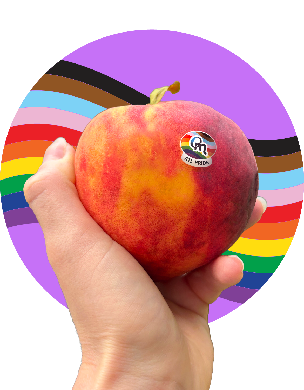

Our hearts are forever in Atlanta
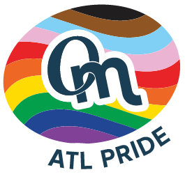
Leave it to the queer nonbinary designer (me) to take what was supposed to be a quick mock up of a sticker and turn it into a whole thing. My defining idea was our staff showing up with love and support for our city and for each other.
I used peach illustrations and colors throughout to rep the Peach State. Although some of the state may still disagree, Atlanta loves a pride party. Cheers, queers.
The circle heart motif originated from the O in the main logo (below). They symbolize showing up in the community as your whole self, heart on display. Hearts can be customized to represent any pride flag and can be used alone or with the main logo (above).

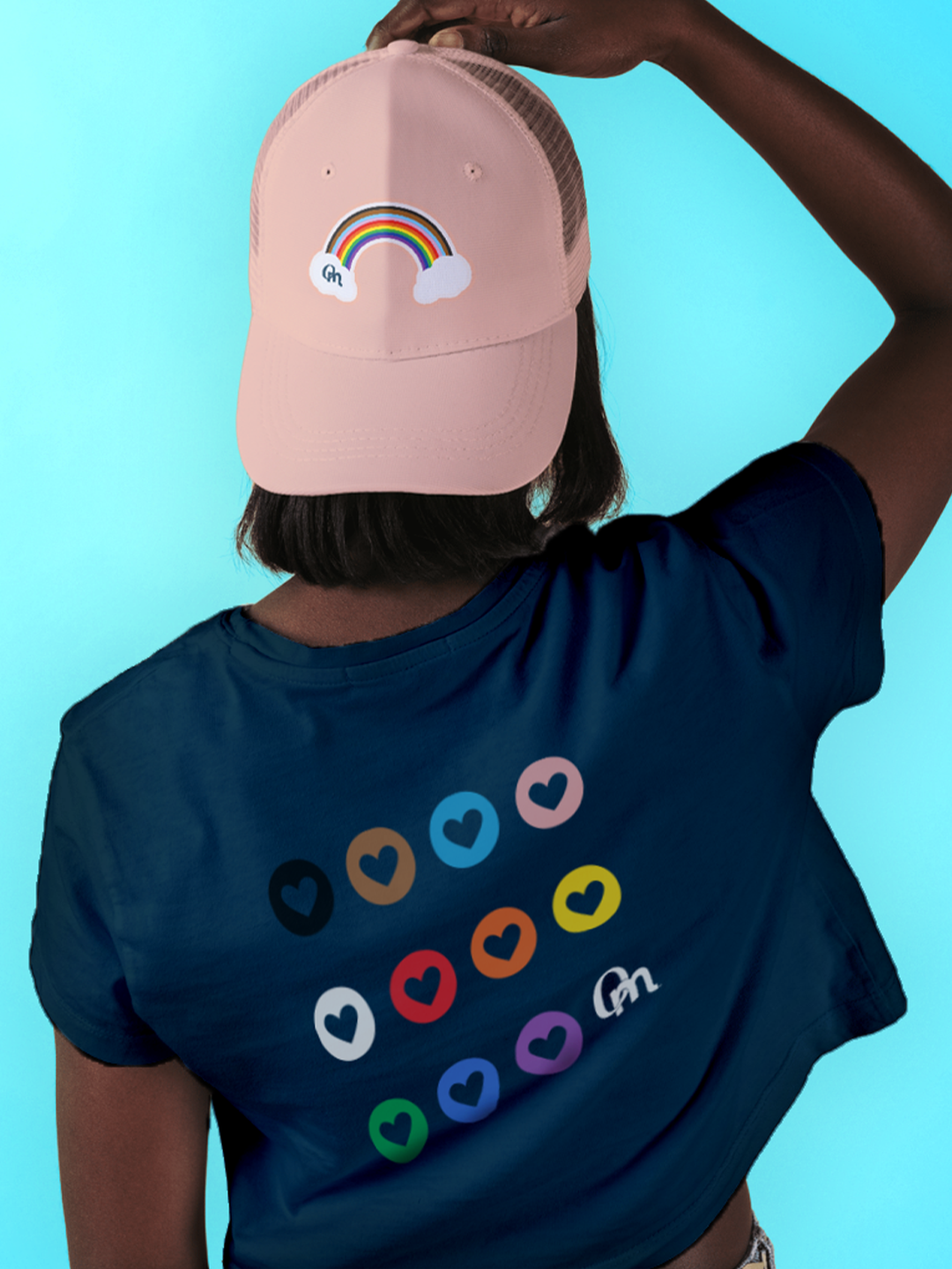
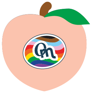
We’ve got tees & hats & lots of gay little stickers